You are using an out of date browser. It may not display this or other websites correctly.
You should upgrade or use an alternative browser.
You should upgrade or use an alternative browser.
Gifted Boba Maker Helmet Repair/Paint-Up
- Thread starter ShortFuse
- Start date
Hey ya Justin,
Those color variations looks really really good! Keep it up!
Those color variations looks really really good! Keep it up!
ShortFuse
Well-Known Hunter
Thanks.Looking awesome!
Thank you.Looks beautiful! The back panels on ROTJ look like a nightmare!
It is. I hate it.
Thank you kind sir.Hey ya Justin,
Those color variations looks really really good! Keep it up!
ShortFuse
Well-Known Hunter
Since I finished my EE-3 last week, I can now turn my attention back to the helmet.
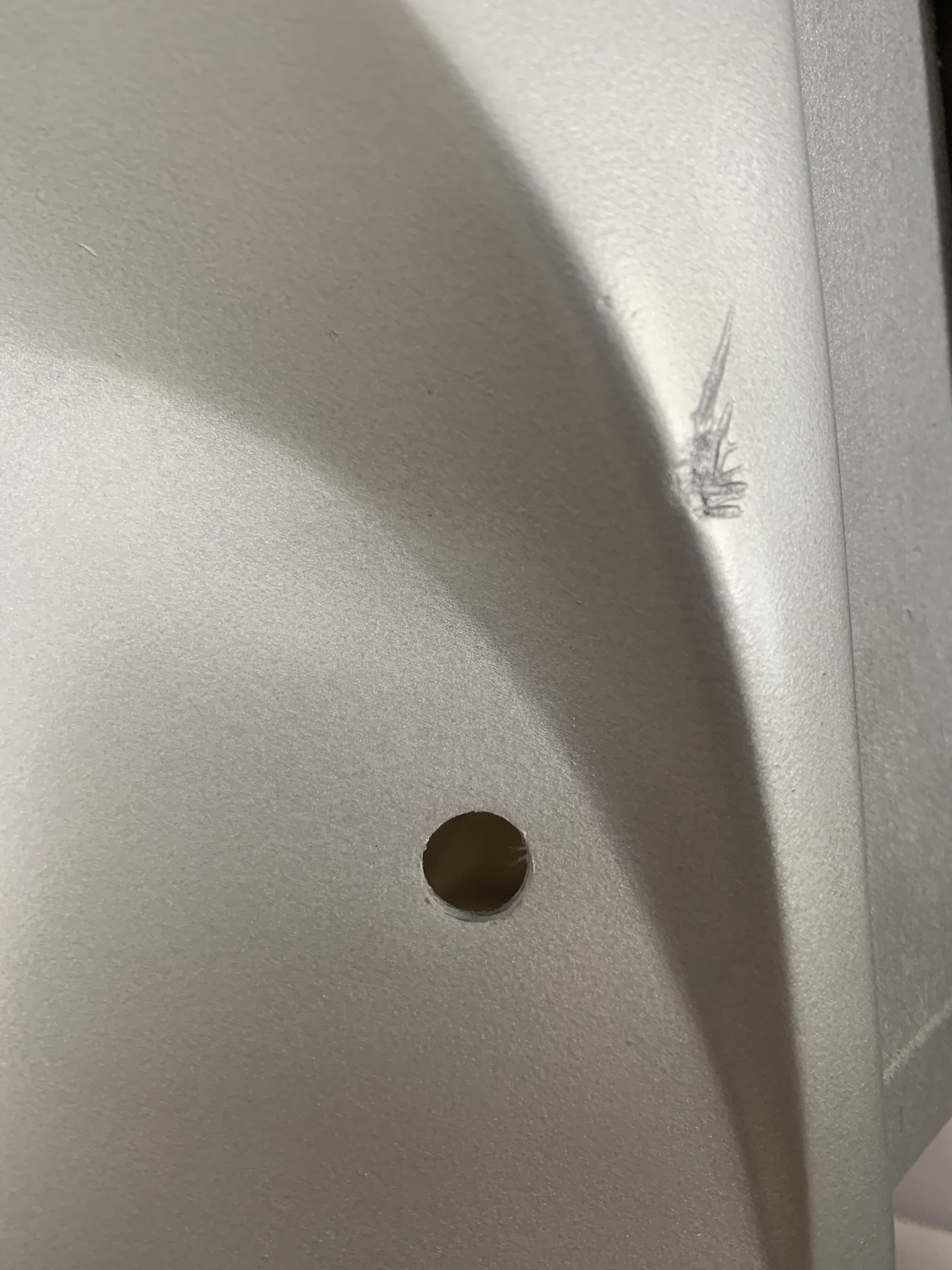
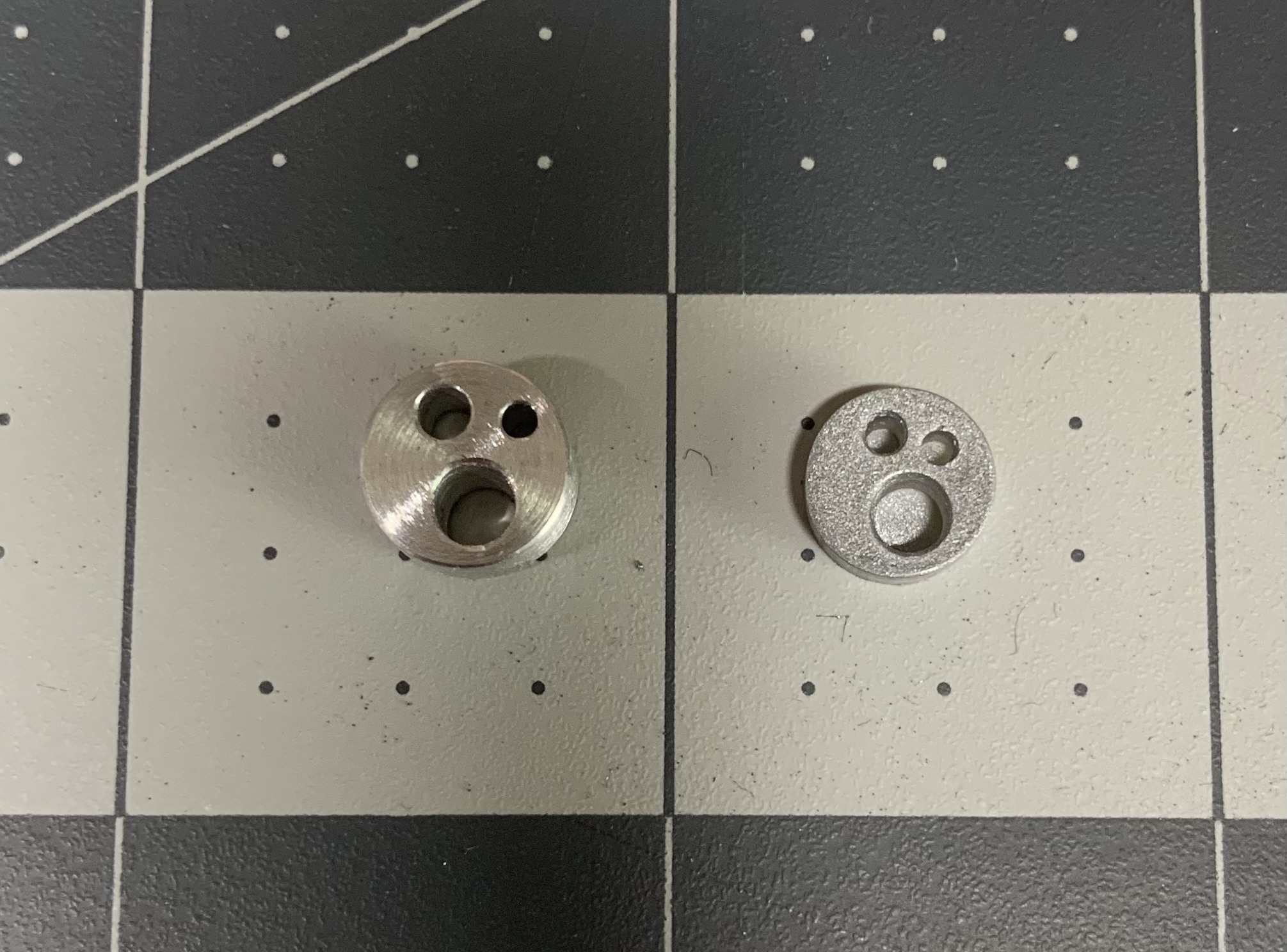
First I enlarged the hole for the borden because it was much too small for the aluminum one I have. The kit came with a small resin one.
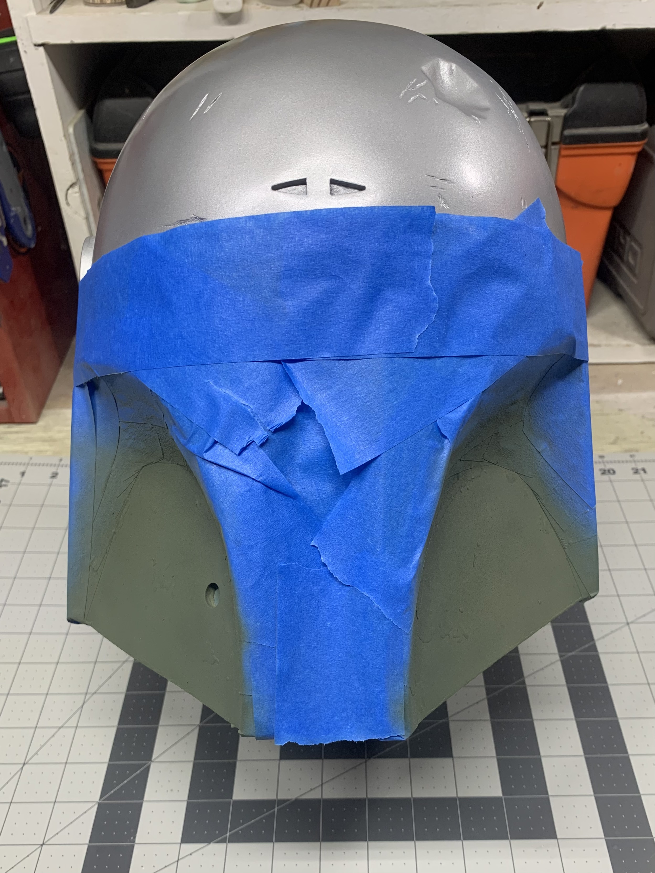
Masked up and green shot on.
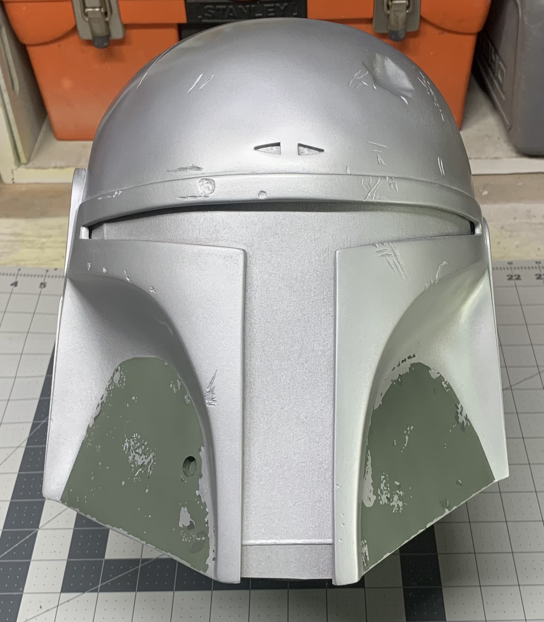
Silver damage completed.
First I enlarged the hole for the borden because it was much too small for the aluminum one I have. The kit came with a small resin one.
Masked up and green shot on.
Silver damage completed.
This is shaping up great! Keep it up!


AlphaCloneFett
Active Hunter
looking good! should there be a lighter shade of green in the cheek area?
ShortFuse
Well-Known Hunter
This is only just the silver so far. The other color layers, which will be done topically, including the fern green are still yet to come.looking good! should there be a lighter shade of green in the cheek area?
AlphaCloneFett
Active Hunter
This is only just the silver so far. The other color layers, which will be done topically, including the fern green are still yet to come.
ah ok, cool!
AlphaCloneFett
Active Hunter
That green is too 'minty'. You should dull it down to be closer to the main green.
agree, should be more subtle
ShortFuse
Well-Known Hunter
Thanks.That green is too 'minty'. You should dull it down to be closer to the main green.
PinkFlamingos6
Active Hunter
Looking good! I like that blue!
ShortFuse
Well-Known Hunter
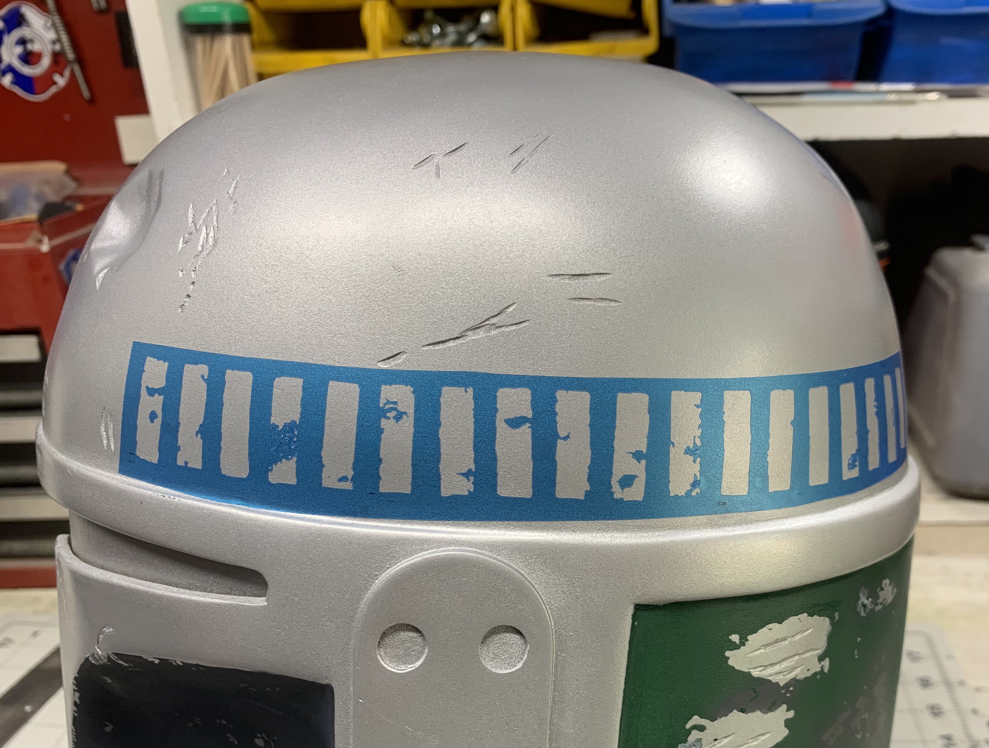
Thanks. It’s flat black misted with Testors sea blue.Looking good! I like that blue!
ShortFuse
Well-Known Hunter
Thanks. I’m happy with it. It’s the method I’ve used on my last two ROTJ helmets. You can really see the blue/green hues depending on how the light hits it.
ShortFuse
Well-Known Hunter
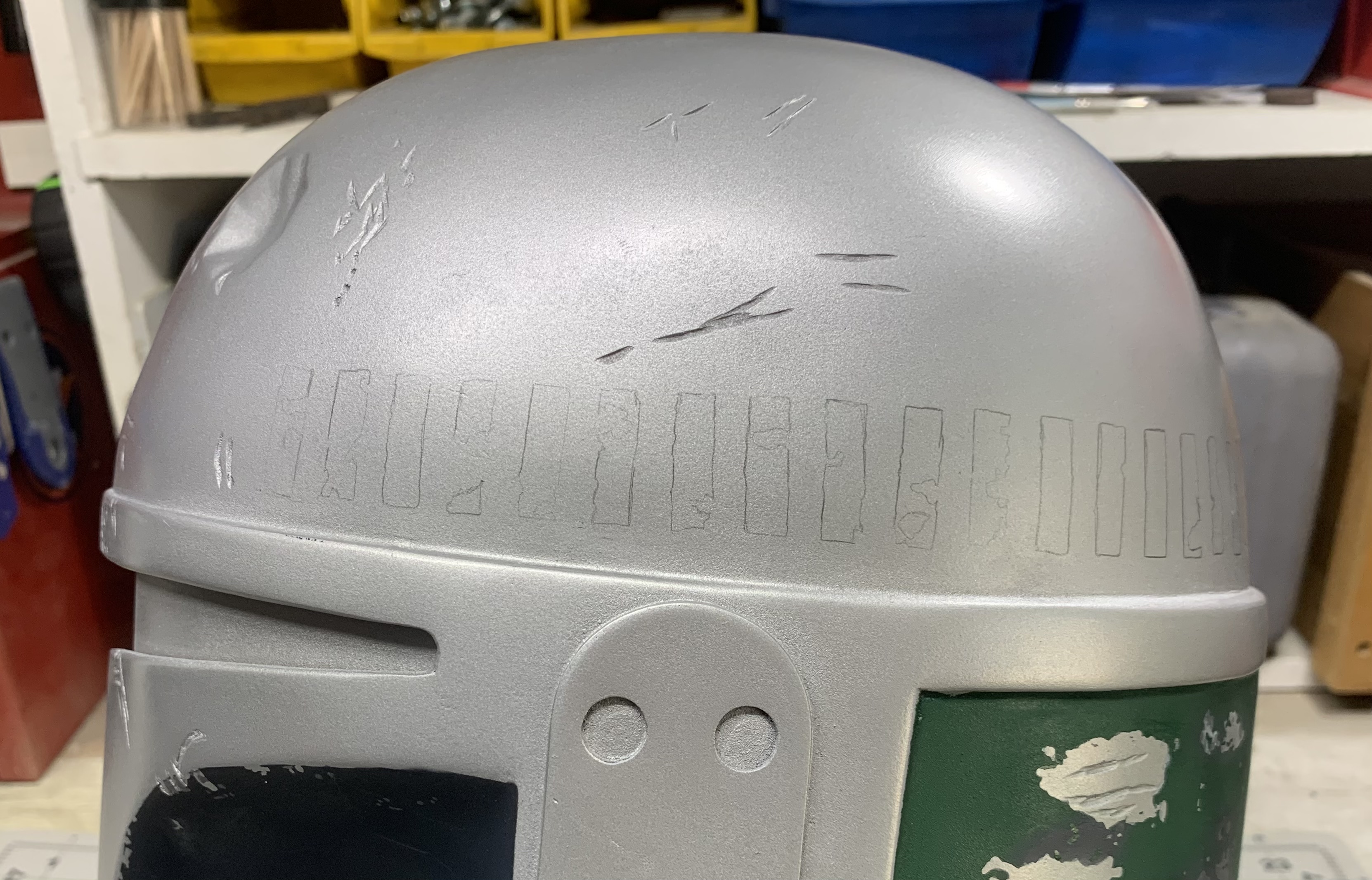
Made up a stencil for the killstripes so I could lightly trace the shape in order to line up the surrounding damage properly. This is the first time I have used this method and had been a difficult step for me on my previous helmet getting everything lined up correctly. In theory it should help.
Similar threads
- Replies
- 1
- Views
- 1,228
- Replies
- 0
- Views
- 2,216
- Replies
- 3
- Views
- 2,762
- Replies
- 99
- Views
- 19,067
