RamSkirata
Active Hunter
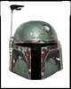
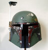
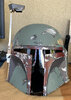
That was a really helpful comment!I'm a photographer. This picture is totally bogus, colour-wise. It is over saturated. This isn't what that table, any of those greys or that shade of green look like in person. I am certain.
Green is probably the most difficult colour to photograph, and this image is clearly not depicting reality in any of the colours present, green or otherwise.
This picture is a non-issue.
That said, there is merit to the point, that the original argument, that we have never seen the original Hero in that strange a color on a picture. Reading through all of the statements, it makes me think the answer lies somewhere in between - strange photograph that amplifies the downsides of a specific color used maybe?