clmayfield
Active Hunter
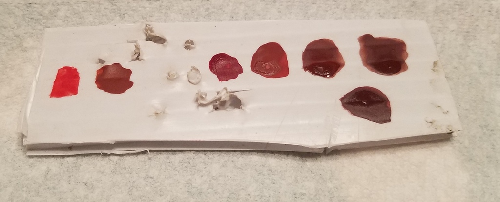
I have not really been satisfied with how the red on my mandibles turned out, but haven't really had the chance to do anything about it. I saw a model train store in Ruidoso, NM, and lo and behold, they had a floquil display and were marking all of those out-of-date colors down. I bought everything that I could think of that might relate to Fett and here is my comparison.

Far left is Floquil Caboose Red, which is obviously good for nothing, but there for comparison and for reference.
Second from the left is Polly Scale Zinc Chromate Primer. That is recommended for the Pulce blaster, but I actually think it might make a darned good mandible color.
Sorry for the bullet holes... that is a plastic backer for a target I shoot at.
Third from the left is trusty Humbrol 73. I have always thought that this was too saturated of a red on its own for ESB, but it is actually pretty darned good.
Fourth from the left is a custom mix I created for my ESB bucket. I kept going back and forth adding white, black, and grey as well as a little Caboose Red to get this color right. In the end, I failed. In hindsight, what I should have added was some yellow to bring out a browner tint. I did paint this on my mandibles, but ended up misting with Humbrol 73 as it was too strawberry in the end for me.
Fifth from the left is Floquil Boxcar Red. Here is where it gets interesting as, to my eye, both wet and dry, Boxcar Red appears identical to Flat Caboose (pictured at the far right). I look at it, and it really looks too brown for the mandible color on its own. Many have said that this is the right color, but I feel like it would be better off mixed with some Humbrol 73.
You see a dot below and between the Boxcar Red and Flat Caboose. That is actually a customer color that I created for the purple / maroon. Ironically, it is almost the spitting image of Boxcar Red and Flat Caboose. I had thought about blinding off my mandibles and misting Flat Caboose over what I have, but what I have decided is that the colors I chose work together well. If I redo my red, I will need to redo purple / maroon as well and I don't really want to do that much of a makeover.
If I ever decide to paint another ESB bucket (and the last one almost killed me), I would likely use a mixture of Humbrol 73 and Boxcar Red/ Flat Caboose for the red and Boxcar Red/ Flat Caboose and Humbrol Blue 109 for the purple / maroon. I would then try to adjust saturation levels with greys, whites, or blacks.
