First Time Beginner Paints an ESB

lowberg

New Hunter
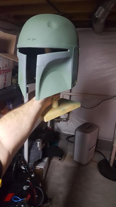
Hey guys I'm a beginner and first off thank you so much for posting so much great information! The amount I've learned from just reading ppl's builds have been immense!

I'm painting my first ever Fett helmet, trying to do an ESB paint job. As a beginner I used Jigglenomicon's ESB Humbrol color guide to purchase my paints. Unfortunately the hobby shop in my town has a very limited color selection so I've had to purchase online.

The guide recommends Humbrol 76 or a 76 + 78 Mix. I've tried a bunch of combinations and still feel lost, 76 seems too light and the 78 seems too vibrant :( The best I got was mixing 76 with some blue and white to change the hue.

The helmet looks so different in different reference photos, changing color in different lighting. Does it just look weird because there's no other color on the helmet? It looks so "Statue of Liberty" green to me.

X5Awmfs.jpg


NnfKA05.jpg


XNBDhsw.jpg


Will weathering at a later stage help? Any help or recommendations would be much appreciated!
 
Last edited by a moderator:
Be weary that the reference image you have posted is washed out with a direct flash. Try to use references with consistent lighting throughout so you can get a more accurate color match. It always looks funky when there isn't damage to tone it down, I had a similar optical effect on mine. If you are worried that it's too bright, you can always go in with pigments or washes later to tone it down. The weathering is the step where you can kinda cheat the tone matching a bit if you went a little too bright.


Sent from my iPhone
 
Last edited by a moderator:
Trust the colors. You can't see the true colors until they start to play off of each other. The colors pallet is tried and true for the most part. Just keep trudging on.
 
Last edited by a moderator:
Be weary that the reference image you have posted is washed out with a direct flash. Try to use references with consistent lighting throughout so you can get a more accurate color match. It always looks funky when there isn't damage to tone it down, I had a similar optical effect on mine. If you are worried that it's too bright, you can always go in with pigments or washes later to tone it down. The weathering is the step where you can kinda cheat the tone matching a bit if you went a little too bright.


Sent from my iPhone

Man I had forgotten about how yours looked so drastically different in different lighting. That really goes to show that you have to really watch what you're doing when it comes to these paint jobs.
 
Last edited by a moderator:
Man I had forgotten about how yours looked so drastically different in different lighting. That really goes to show that you have to really watch what you're doing when it comes to these paint jobs.

Oh yeah, the photos I posted on my thread look like a rainbow because of all the different lighting situations, it makes it a bit hard to follow. As I finish more commissions I'll be posting more thorough threads with photos with consistent lighting, that way people can follow my color matching better. Best thing to do is to take pictures of the piece in tungsten, outdoor, and flash lighting. That way, you cover all your bases and can get the most accurate match.
 
Last edited by a moderator:
The original costume is quite lighter than we remember for some reason, I'd say you're pretty well ball-parked. The other colors absolutely will affect it's perception, the classic optical illusion contrast effect, and yeah, expect any weathering washes to knock everything down a shade or so too. If you'd like to change it to something you more like though, I'd say go ahead, the variable appearance of the original color offers a sorta wide window to get a color you personally think is more 'right'. I've seen a lot of really amazing paint ups which are a way-off dark green, but still look very ESB iconic.
 
Last edited by a moderator:
Thanks guys for the responses and re-assurance!

One of the things I've realized is that my perception of the colors are skewed from seeing 1,000's of artist interpretations of him from over the years in artwork, action figures, video games, posters ect.
 
Last edited by a moderator:
Thanks guys for the responses and re-assurance!

One of the things I've realized is that my perception of the colors are skewed from seeing 1,000's of artist interpretations of him from over the years in artwork, action figures, video games, posters ect.

Which if you're going for color accuracy that's all the more reason to study the gallery photos extensively. As the others have said though once you put the damage on it will tone it down a bunch but so far it looks pretty good.
 
Last edited by a moderator:
Oh I'm sure I'll end up getting super deep into it. I've gotten way way too deep before in movie props....I'm pretty sure I could list every part, bolt size, and nuance on a Ghostbusters Proton Pack by memory :$ ... just looking forward to moving into the Star Wars world!
 
Last edited by a moderator:
I am in the middle of this and I have had to start over twice. I am not to the green on the dome yet (I am layering up). On the back, I found that 106 is definitely the right grey. Grey 79 is too dark. I had to repaint after using it. There is no contrast with the green (this is also true with the armor, I find out too late). And I skipped Humbrol and used Model Masters concrete for the concrete color because the paints I was blending could not get me the right concrete color.

While I haven't gotten to the green yet, I am thinking I will go for 78, and probably mix in a little white. 76 is too Kermit the frog. As Mulreel pointed out, this is going to depend on how it goes with the rest of your color scheme. The helmet green needs to be lighter than your armor, which is why I plan on adding a little white to the mix. What you have looks fine, but I would compare it to your armor and to reference photos. And even with the reference photos, try to keep consistent with either the blue filter on or the blue filter color corrected out.
 
Last edited by a moderator:
You also have to realize the helmet has washes/splattering/misting of paint its not just some green paint


It's amazing what the washes/splattering/misting does to visually change the color of the green!
 
Last edited by a moderator:
Thanks again for all your help and suggestions, I've changed the title of this thread as it may as well be my official build thread now :cool.

This is just going to be a display piece, no matching armor and costume in the works currently :unsure
 
In that case... I looked at the reference pics, and it looks pretty close. What you do have to remember is that as you weather it, it will only get darker, not lighter, so a green that looks a little too light will probably end up spot on after you weather it.

What you have there appears to match very well.
i couldnt agree more! ! Always keep weathering in mind when choosing your colors!
 
It's looking good.....

As the others have said, the photo conditions play a big part..... For me, it was mixing paint swatches, then taking pics indoor/outdoor, with/without flash.

And Dom said it too, there are washes and splatters on it. Also, the order in which you lay the paint, the colors will react to each other.

And imo, the helmet is darker than you think...... there's a pic of Gino with the ESB when he was casting it for EFX.
 
Update:


Decided to follow SuperJedi's approach going forward and do a mix of layered and topical techniques.


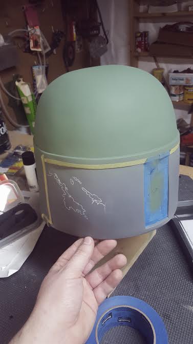
I sprayed the cream /concrete color down on the back panels, and after 5 attempts at resizing templates I finally got a "good-enough" fit for my back panel templates!
Used the Saral transfer paper to trace on the concrete damage, the Saral went on super sharp and clean.


MTmcT8n.jpg


Applying the masking fluid with a tiny brush was WAY more difficult....lots of respect for you guys who do 100% layered paint jobs. I can't imagine doing this over and over....
Took me a good hour to block them in, the hardest part was trying to get in the small areas and not have "blobby" edges


FsI87sD.jpg


Mixed up a decent looking color for the dark green, and did that layer. The humbrol masking fluid works so well, I've used a different kind in the past for other projects and it was no-where near as good!


b19fOkF.jpg


fg1pfah.jpg


QCa8Qvs.jpg


I can already see how the dome green looks better with more colors in the mix!
 
It's been a really long time since I've committed to working on this! But I'm determined to get back to it!

I finished the back panels to the best of my ability. I still have to do some topical details with a brush.
Struggled a lot with the silver, as I can not for the life of me find a good self leveling silver locally that minimizes brush strokes.
I ended up carefully sanding down the original silver on the right panel and airbrushing it on carefully with masking fluid
iWESdZn.jpg


After completing the back panels, I pretty much figured out how I'm going to go forward with the rest of the helmet. Doing a mix of sectional airbrushing for the larger "important" sections and then using a fine brush for the smaller details.

I decided to try a reverse-masking technique for a "stencil" type approach.
Masking up the main dome dent and scratch

AoKYEvG.jpg


Reverse masking worked out great!
rooL3o2.jpg


Then I did all the larger damage on the left side of the dome, with reverse masking.

So satisfying!
ZgyP18z.jpg


IaPwQpi.jpg


Then used a fine bush to paint the base gray and silver details.

Jwr7Z4d.jpg

kEvhiSh.jpg

Bm9apfX.jpg


I bought a stencil for the killstripe area, so I'm waiting on that next!
 
This thread is more than 5 years old.

Your message may be considered spam for the following reasons:

  1. This thread hasn't been active in some time. A new post in this thread might not contribute constructively to this discussion after so long.
If you wish to reply despite these issues, check the box below before replying.
Be aware that malicious compliance may result in more severe penalties.
Back
Top