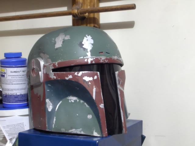
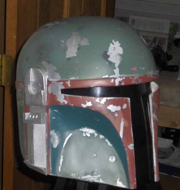
Painting the Grant McCune Helmet (GMH)

Great post Alex! Looking good.

Nice research all around! I love the teamwork. I have been sleeping on the job and forgot I should post my old PP2 for some comparisons. Sorry about the ****** pictures.
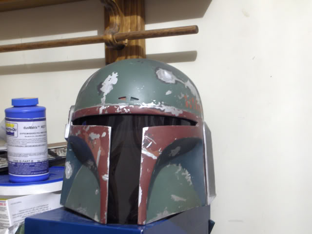
HPIM4480.jpg


The main color is POG but I tweaked it with some other color.


Different lighting.
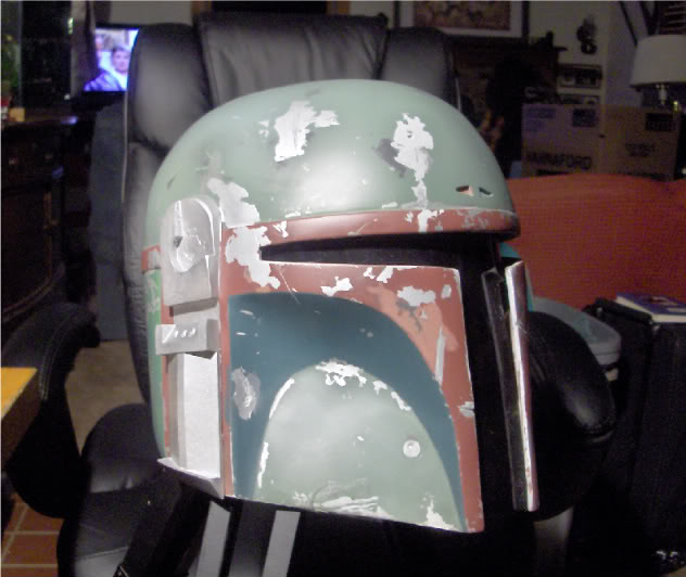
HPIM4572.jpg

HPIM4482.jpg

HPIM4553.jpg


I am rather embarrassed about this paintjob. It was a rush job and doesnt look half as nice in person. I cant wait to take another whack at the PP2 with the GMH !
 
Now that there is a fancy test bed! It's the Fett version of Two-Face.
The skin tone is definitely too "peachy" looking. Not sure how the Dark Sea Blue looks in person, but it has a pretty good quality in the pics, and I don't make a habit of saying this to guys, but nice Caboose! :lol:
Did you do any misting over the RLM 82 on the dome/lower cheeks?

KB, what color did you use on the darker cheek crescents?
 
Great post Alex! Looking good.

Nice research all around! I love the teamwork. I have been sleeping on the job and forgot I should post my old PP2 for some comparisons. Sorry about the ****** pictures. I am rather embarrassed about this paintjob. It was a rush job and doesnt look half as nice in person. I cant wait to take another whack at the PP2 with the GMH !

I think it looks great K...(y)
Now you know I have like a million questions right??
POG for the Dome..hmmm.. and what for the Mandibles and Under Cheeks?? I like it.
 
I think the mandibles were Boxcar red. I may have tweaked it but I dont think so.

You guys are going to hate me for the upper check color because its not off the shelf.

Ready for the secret ingredients? Testors green and Testors blue. LOL Seems very anticlimactic with what is going on in this thread but it seems to work.
 
Its been a while since I painted/owned this helmet so I will try to hunt up a picture of the back.

Its all about the misting with the PP2/ROTJ style IMO.


*found pictures.

HPIM4484.jpg

HPIM4485.jpg


So apparently I am just a total hack. LOL. I just hunted my original post down;

"The base color is POG with a bit of blue-gray added to cheat to the ROTJ color. I wasnt suckered in by the blue of the Kenner shoot though. The mandibles are Boxcar Red. They were out of Caboose.
The upper cheek color (which I am very pleased with) I mixed myself with blue and green Testors and some other colors I cant remember. Same with the back green color which I'm not 100% happy with. The light pinkish color is also not 100%. I made it a bit orange which I knew was a mistake. But its close enough for me. The killstripes are a home mix too.

I am overspraying with some light gray and that blue-gray. I also gave it a small amount of tan here and there. The mandibles are misted with the pink color in a few places."


It looks like most of the colors were either tweaked or home mixed. Sorry I couldnt be helpful by testing off the shelf colors.
Carry on gents!
 
Last edited by a moderator:
Now that there is a fancy test bed! It's the Fett version of Two-Face. Did you do any misting over the RLM 82 on the dome/lower cheeks?

Yeah I had to half it cause I only have one none painted helmet right now, need to use the otherside for one more test...

And not too much misting or weathering on the dome or cheeks, just wanted to focus on the base colors.

You guys are going to hate me for the upper check color because its not off the shelf.
Ready for the secret ingredients? Testors green and Testors blue. LOL Seems very anticlimactic with what is going on in this thread but it seems to work.
WHAAAA?? (vader ROTS voice) "Noooooooooo!"

Its all about the misting with the PP2/ROTJ style IMO.
"here here"(y)
 
Could anyone try the "Floquil Weathered Deck Blue". It's really hard to buy Floquil paint here so that's why I'm asking for someone to do it...
 
The back panels on the ROTJ at least are WAY more of a brilliant green than what I think you guys are looking at. And Spidey I dont think your upper cheeks are too blue really look here theyre supposed to be blue, and you gotta think this stuff is FADED here so when it was new it was probably even more brilliant.
MoM_2001-08-07_001.JPG
 
And Spidey I dont think your upper cheeks are too blue really look here theyre supposed to be blue, and you gotta think this stuff is FADED here so when it was new it was probably even more brilliant.

F4R, I think you are correct, but keep in mind my lighting wasn't too great, I think more blue is something we both agree on. That's why I think you will like this next test. (y)


TEST #2 :

Okay after this test I'm pretty happy with the results of the Dome, Cheeks, and the under Cheek color. Again these are just straight base color tests, and no weathering has been added. I added one with flash to show the contrast/color change.

Colors I like: I have to say, and I'll say it again, I like the Dunkelgrun RLM 82 for the Dome and Cheeks. More so now with the flash test... I'm sticking to that one.(y)

I also love the Schwarzgrun RLM 70 for the under cheeks. Compared to the RLM 73 I think this has slightly more blue, but less than the Dark Sea Blue... more so when the RLM 70 is sitting next to the RLM 82 (cheek color), the blue hue just shows up more. I'm sticking to that one (y)

Colors I don't like:
Wisconson Central Maroon, with and without flash just has way too much of a violet hue to it...I think allot has to do with the fact there is a silver base color, and if it just doesn't look right doing layered, then it can't be it. I'm officially taking WCMaroon off my list... Thanks Superjedi. CABOOSE it is.(y)

attachment.php


PP2 TEST #2.jpg
 
Ah, more testage! I may have to check out that RLM 82. . .
Here's a quick compare on the dark cheek sections. It does appears that the Schwarzgrun has more of a blue-green quality than the first color, but it still looks like a "greener" color than either the Dk. Sea Blue or C&O.

SpideyTestcompare.jpg
 
UPDATED 10/24/2010 (previous list on post #37)

Okay I'm pretty happy with the results on these last few tests..
Based on my earlier tests and these new ones, I think I'm at a stopping point.
Other than the Pink on the mandibles, which I'm convinced is a custom mix, I'm going to take a break from testing..

I hope these have helped in some way.. Great work everyone. (y)

Spidey's ROTJ/ PP2 list:
  • Helmet dome and cheeks: Dunkelgrum RLM 82 (Model Masters SKU#2091)
  • Mandibles: Caboose (Floquil/ Polly Scale SKU# F110088)
  • Pink on the Mandibles: ???
  • Random Gray scratches: SP Lark Dark Grey (Floquil SKU# F110132)
  • Under cheeks: Schwarzgrun RLM 70 (Model Masters SKU#2080)
  • Back of helmet: CNW Green (Floquil/ Polly Scale SKU# F110262)
  • Kill Stripes: Southern Pacific Scarlet (Floquil/ SKU#F110136)

attachment.php


PP2  ROTJ COLOS Final.jpg
 
Last edited by a moderator:
OK finally got my paint tests done for the mandible red (even though we seem to have settled on caboose. I also tried rock island maroon as the pink I think it might be a possibility but I wanna see what you guys think.

paintcomp.jpg


My topical test with different grays didn't turn out like I thought they might. Optical color mixing is a funny thing our eyes and brains can deceive us even in person.
 
NikNak, nice sample! That really shows the Boxcar and Caboose being very close in various lighting.
I think the RI Maroon shows good contrast against the darker reds, but it still is too reddish itself.
 
Spidey I REALLY like the RLM 70 the 82 with flash looks good but without it looks darker than I think it should be...after seeing that 70 though I think that is the color...I want to repaint the upper cheeks on my ROTJ now....just seeing that makes mine look to blue especially with the flash mine get very blue
 
I unfortunately have nothing to add here except to say that I find this thread fascinating and I'm thrilled to see such teamwork!
 
Spidey I REALLY like the RLM 70 the 82 with flash looks good but without it looks darker than I think it should be...after seeing that 70 though I think that is the color...I want to repaint the upper cheeks on my ROTJ now....just seeing that makes mine look to blue especially with the flash mine get very blue

On the RLM82 for the dome, it looks better in sun light, and once misted/weathered with a light blueish gray it starts to look like its suppose to.
Agreed, the RLM 70 to me is perfect for the under cheeks, still has a green hue but with just enough blue to make it look right, even with flash...i'm pretty happy with it. It starts to get darker once you weather it too.
 
This thread is more than 7 years old.

Your message may be considered spam for the following reasons:

  1. This thread hasn't been active in some time. A new post in this thread might not contribute constructively to this discussion after so long.
If you wish to reply despite these issues, check the box below before replying.
Be aware that malicious compliance may result in more severe penalties.
Back
Top