JangoUri
Active Hunter
Sup guys! I would like to show you what I've done with my 3.0 updating till now, and what I'm gonna do.
The new Items I'll add to my 3.0 and final (yes! This time is true! ) version, are:
->> From:
1 - BKBT 2.0 Helmet SOLD
2 - Starfortress Flak vest SOLD
3 - Leather gloves - SOLD
4 - Kenneth Cole boots with some spoiled sole - SOLD
5 - JD Armor - SOLD
6 - Cotton Girth Belt - SOLD
To -->
1 - Original helmet cast - FP CC Helmet
2 - New Flak Vest - LoanStar vest
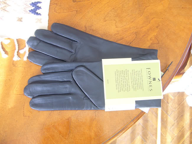
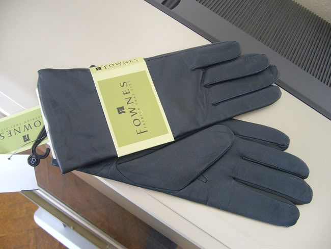
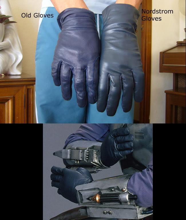
3 - Nordstrom gloves - Shown in pics
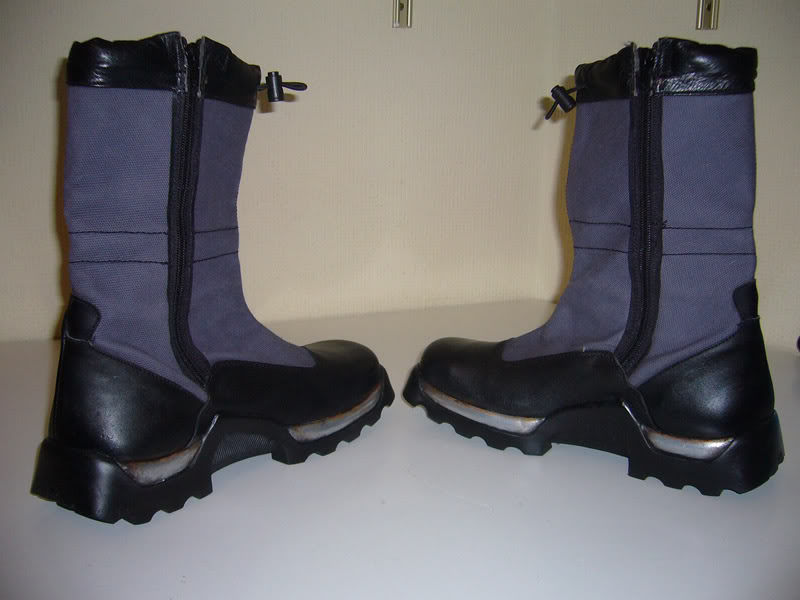
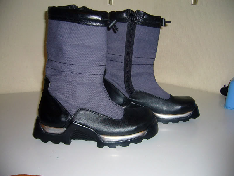
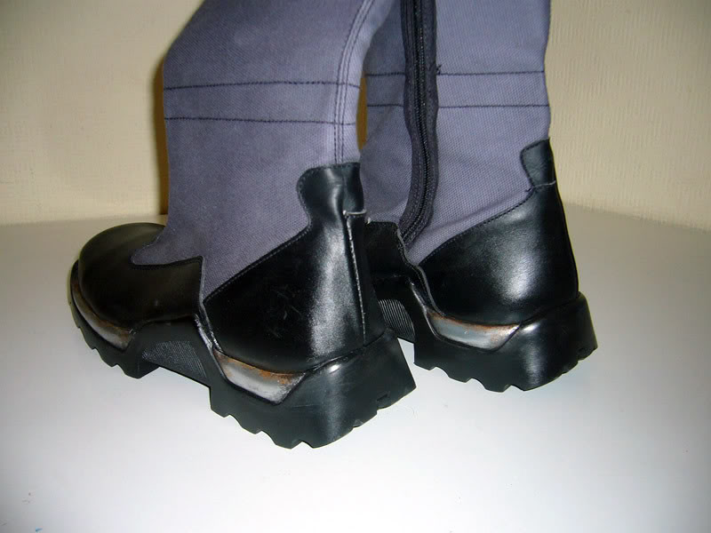
4 - Reinone Boots - Shown in pics
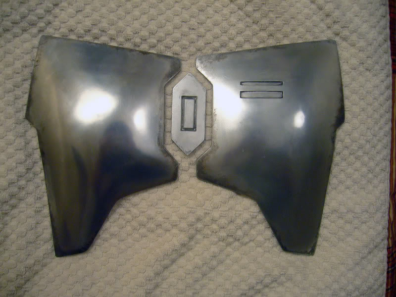
5 - BKBT 2.0 armor, shoulders and collar. Top Chest armor shown in pics.
6 - New Girth Belt
- Some Nordstrom gloves's pics
It's awesome how close they are to the originals:
- Reinone finished boots:
- BKBT 2.0 Armor. This is what I have done at the moment. Light is not as good as I'd like, I hope to can make some DayLight pics soon:
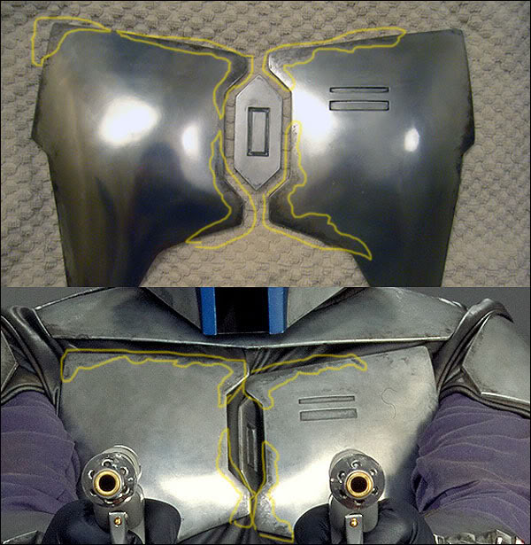
I've even respect the original zones, trying to make it as close as posible:
That's all at the moment. I'll post new pics as soon as I have something to show
Can't wait to receive the Original Cast Helmet and start working on it.
Hope you like it!!!
The new Items I'll add to my 3.0 and final (yes! This time is true!
->> From:
1 - BKBT 2.0 Helmet SOLD
2 - Starfortress Flak vest SOLD
3 - Leather gloves - SOLD
4 - Kenneth Cole boots with some spoiled sole - SOLD
5 - JD Armor - SOLD
6 - Cotton Girth Belt - SOLD
To -->
1 - Original helmet cast - FP CC Helmet
2 - New Flak Vest - LoanStar vest
3 - Nordstrom gloves - Shown in pics
4 - Reinone Boots - Shown in pics
5 - BKBT 2.0 armor, shoulders and collar. Top Chest armor shown in pics.
6 - New Girth Belt
- Some Nordstrom gloves's pics
It's awesome how close they are to the originals:
- Reinone finished boots:
- BKBT 2.0 Armor. This is what I have done at the moment. Light is not as good as I'd like, I hope to can make some DayLight pics soon:
I've even respect the original zones, trying to make it as close as posible:
That's all at the moment. I'll post new pics as soon as I have something to show
Can't wait to receive the Original Cast Helmet and start working on it.
Hope you like it!!!
Last edited by a moderator:
