Superjedi's FPH2 for Nemesis

UPDATE: DAY 10

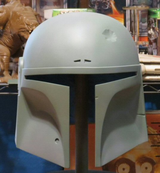
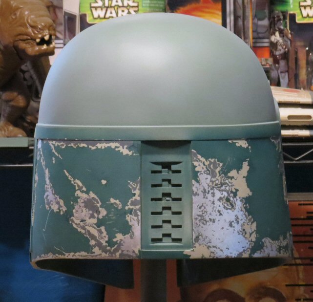
Got the dome and inner cheeks base coated, and did the first weathering pass.
IMG_1944_zpsa8205f74.jpg


When I do the weathering, I mix a lightened shade of the base color and apply it in cloudy diffuse patterns
all over the surface. Some areas receive a slightly higher concentration of the lightened color, and others
just a misty, patchy coat.
IMG_1941_zps974f3b42.jpg


Keep in mind, the contrast may look a little odd in these pics. That's because the dome/cheeks are "naked"
at this point. :lol: After the gray and silver damage is applied, and especially after the red for the mandibles and
band is laid down, things will look more normal.
IMG_1943_zpsf9c9ca58.jpg


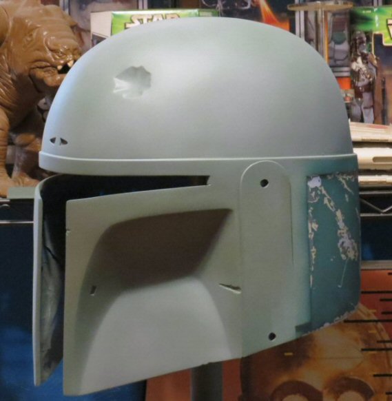
When I do the dome and cheeks, I also lay down the same base coat on the left ear. I simply don't weather
the ear piece. That way, I can use it to gauge how much I'm shifting the color when I weather the helmet. (y)
Next I'll begin applying the gray and silver on the dome. It'll be a gray and silver world for a while now!
 
Quick question and sorry for the derailment. Did this kit come with a hollow rf stalk? The paint job looks awesome.
 
Hi Jc27, thanks, and no problem!
No, the kit arrived with a solid aluminum stalk. I think I remembered reading at some point that they
might come with hollow stalks, but FP was having some kind of issue with his supplier maybe?
 
Jc27 Chris told me after the initial run of these helmets he switched to solid stalk as standard. Sourcing them were a pain. The stalks shapes are the same and you can just switch them out. He offers hollow stocks for an additional fee. This way keeps the cost down a bit.
 
Last edited by a moderator:
UPDATE 2: DAY 10

I pretty much always begin the dome damage at the back. Not sure why, just do. :)
The main areas were stenciled on, then painted with my 5/0 brush. I found some brushes that I really like to use
a couple of helmets ago, and I bought like 4 of them. They have a fatter handle, then taper down toward the bristles.
Gives me a good grip.

IMG_1945_zps86281513.jpg


The fine scratches are done using a combination of Bright Silver and a sharp compass point. Depending on the
lighting angle, you can see what's silver and what's not.

IMG_1946_zpsc15c613a.jpg


The network of fine scratches may seem like it cuts off abruptly on either side, but I need to get some of the other gray
and silver damage in place so I have some landmarks to go by.

IMG_1947_zpsfeb607fd.jpg


I'll start working my way counter-clockwise around the dome now. So next comes the tall thin area behind the RF ear arch.
 
Lookin great man, your are amazing at topical man...i love it.....and thanks for the reply about the silver. I'll try that one out next time!
 
Thanks guys! Always enjoy discussion during these paint ups. :)

UPDATE: DAY 11

This was actually completed yesterday evening, but I lost the light and waited till this morning to take some pics.
I'm continuing around the back of the dome toward the ear. I've always liked this tall area. It just seems different
somehow from other damage areas. It's less recognizable than the dent or the cat scratch, but it's got character!

IMG_1948_zpsec3c732e.jpg


With the dome's base color being weathered down, I often get varying amounts of contrast between the green and
the gray damage. I'm really liking how the contrast is looking on this helmet! Here are two more shots at slightly
different angles. You can see how the gray sort of fades or brightens a bit depending on the lighting and the angle.

IMG_1951_zpsd2345fcd.jpg


IMG_1954_zps520007c2.jpg


I'll cross over the RF ear arch now and start on the three areas that make up the whole cat scratch region. I like to do these
three areas together because the spacing between them is just as important as the damage itself.
 
Looking good. I found a nice set of brushes last paint up also. But didn't go get a bunch before I left town. Gonna hope to order them up when I get back from osan part 2
 
excellent my friend!

I tend to name alot of the damage areas.. i call that one your talking about "the stack" cuz its 3 large "chips" in a vertical "stacked" like configuration. Another one is the beige on the right rear panel where its the most prominent, i call that "the winged dragon" cuz it kind of looks liek that...i can go on and on with the silly names lol.

Anywho, once again, great work man! :cheers
 
SJ,

if im not mistaken you are still using discontinued colors. Have you found any other acrylic colors to match the dome and cheeks green?
 
Thanks a lot, everyone!

DV, I know what you mean about naming the damage areas. I like your 'winged dragon' one! Very nice.
There's one small gray/silver area on the left side of the dome between the long gray streak and the top of the killstripes
that I've started calling the Scottie Dog. I just think that's what the silver part looks like! :lol:

Nemesis, I try not to disturb the Rancor if I can help it. She's pretty well trained, but those teeth!

22, yes, I'm still using my ever-dwindling supply of Floquils and Polly Scales. :( I have put a little time into searching for
replacement colors. But I'll have to really get into research mode soon. I'm afraid by the end of this year, I'm going to
start running out of some of my heavily used Fett colors.

UPDATE 2: DAY 11

Whew! Lots of work this morning. I was finishing up and I was like. . . why is my stomach rumbling. I looked at the time
and almost 4 hours had gone by! Sheesh. . . I just get in the zone I guess. Here's the whole cat scratch region.

IMG_1958_zps07631c52.jpg


Again, from different angles, the gray almost fades into the dome color, which is exactly the effect I'm going for.

IMG_1955_zpsd77c07e2.jpg


Now for some lunch! I'll be working on the areas above and around the turn signals next. Then. . . the dent! (y)
 
this is looking awesome man!

hahahahha i know EXACTLY what one your talking about...i call that same one "the dog"! It completely looks like a scottie dog ! i am stealing that name LOL!

Supposedly the discontinued colors from floquil are all represented in the model master line of testors, but most with different names. Someone had said there is a conversion list somewhere, but i havent been able to find it. I have been mixing humbrols and/or Model master paints to try and match the Floquils i liked. The thing is, the floquils, were the best for the airbrush, very little thinning was needed and thats partially why i loved em so much. The humbrol and Model Master colors are good, but but they need more thinning.
 
This thread is more than 2 years old.

Your message may be considered spam for the following reasons:

  1. This thread hasn't been active in some time. A new post in this thread might not contribute constructively to this discussion after so long.
If you wish to reply despite these issues, check the box below before replying.
Be aware that malicious compliance may result in more severe penalties.
Back
Top